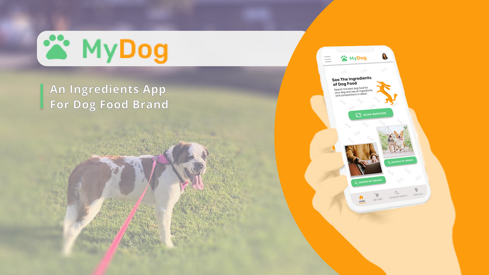
MyDog Mobile App
A UX case study for an ingredients transparency app helping dog owners make informed food choices.
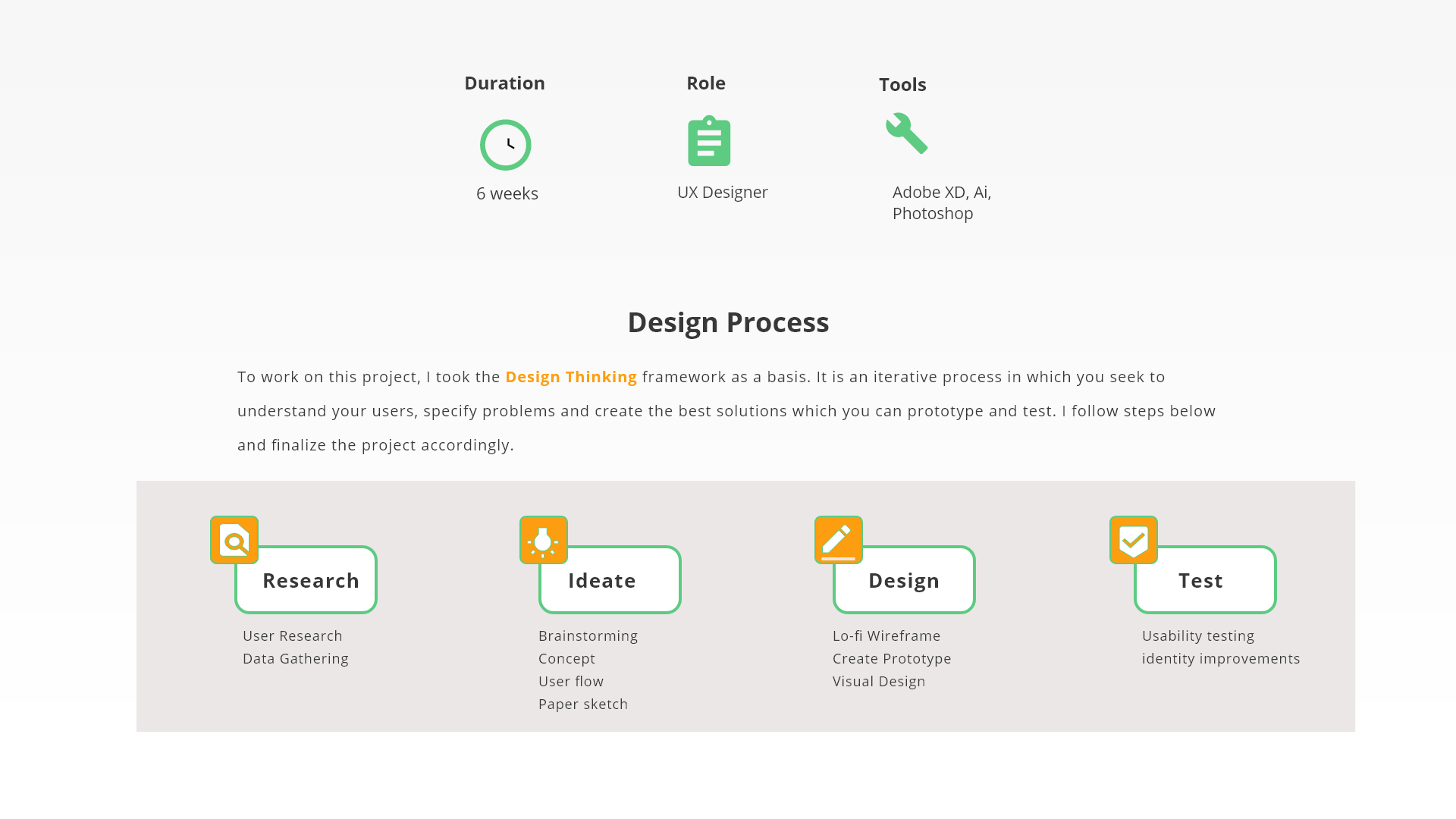
Duration
6 weeks
Role
UX Designer
Tools
Adobe XD, Ai, Photoshop
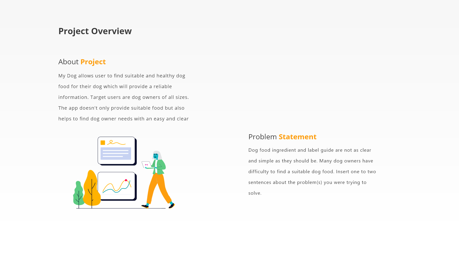
Dog food ingredient labels are confusing and overwhelming. This app helps owners quickly verify if a product is right for their pet's specific needs.
Process at a Glance
Problem & Goal
Goal
Help users confirm product fit in under one minute through barcode scanning and clear ingredient breakdowns.
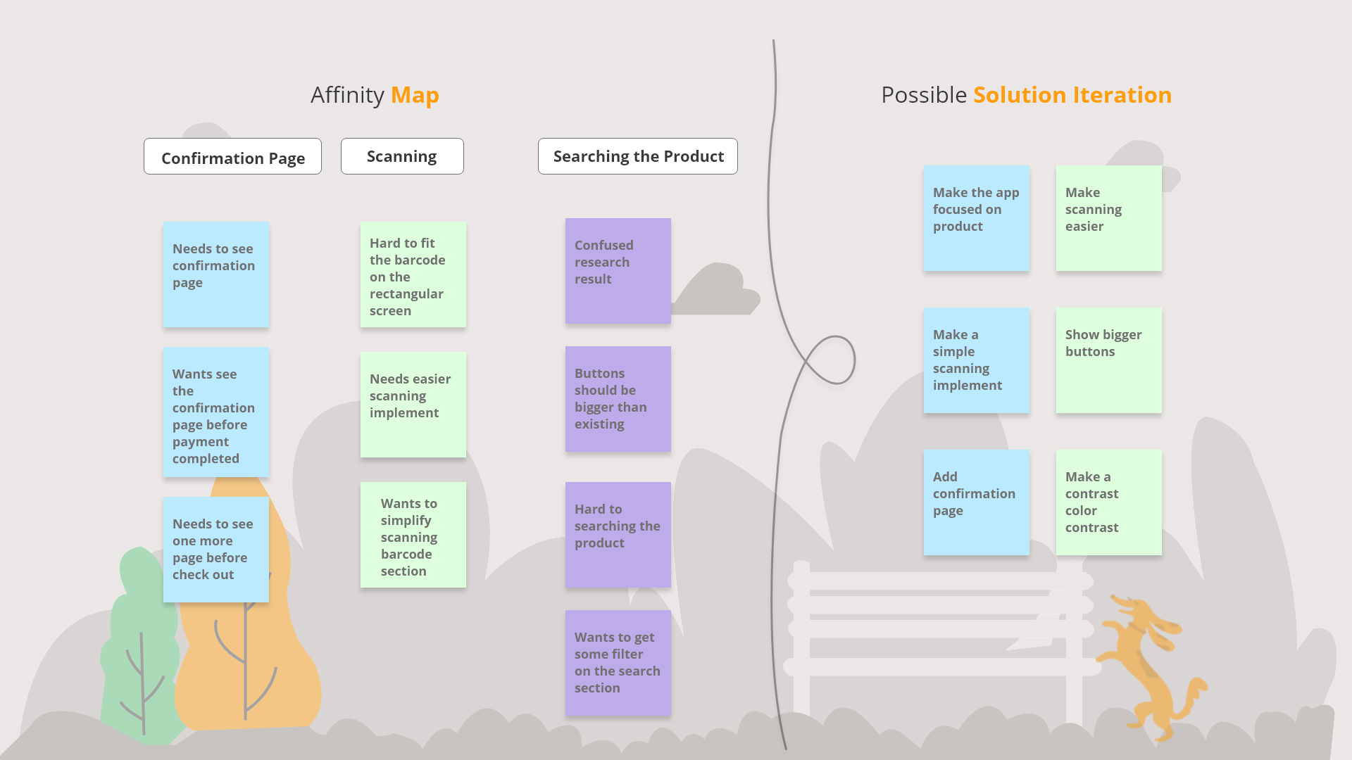
Research Synthesis
Affinity Map
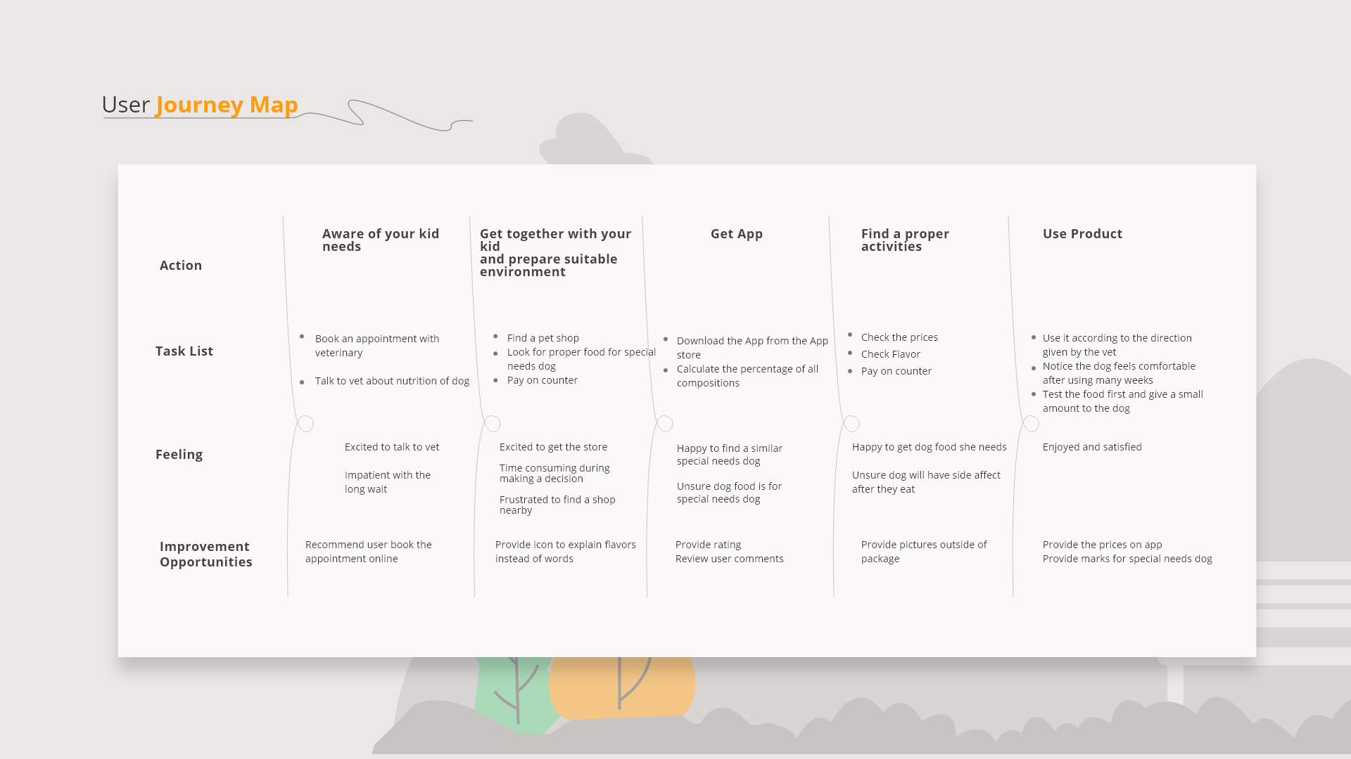
User Journey Map
Key Insights
- Scanning friction: Users found barcode scanning difficult on rectangular screens. This led to a simplified scanning interface with clear visual guidance.
- Confirmation need: Users wanted to see a confirmation page before payment. Added a dedicated confirmation step with order summary.
- Button visibility: Research showed buttons needed to be larger and more prominent. Increased button sizes and improved color contrast.
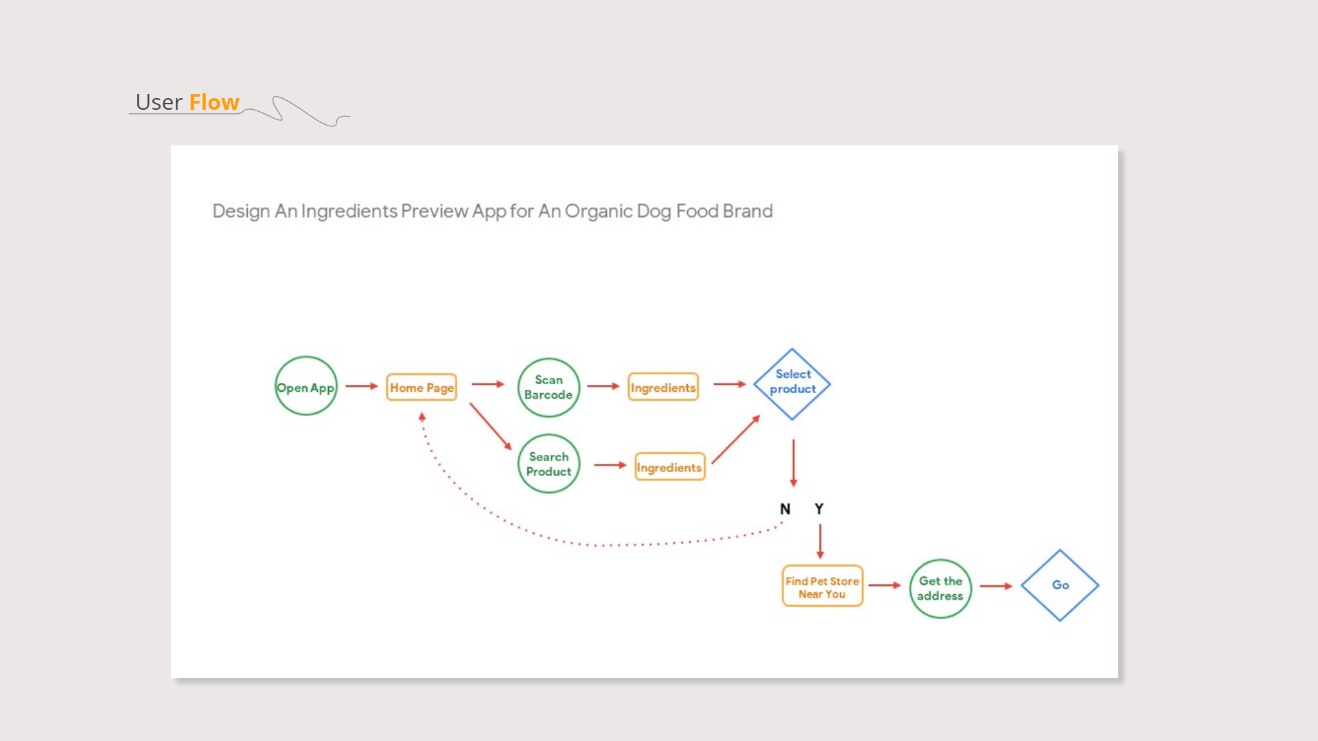
User Flow
Navigation Logic
- Dual entry points: Users can either scan a barcode or search by product name, accommodating different shopping contexts.
- Decision branch: After viewing ingredients, users decide to select product or return to search, keeping the flow non-linear and user-controlled.
- Store locator integration: If users don't find what they need online, they can locate nearby pet stores directly from the app.
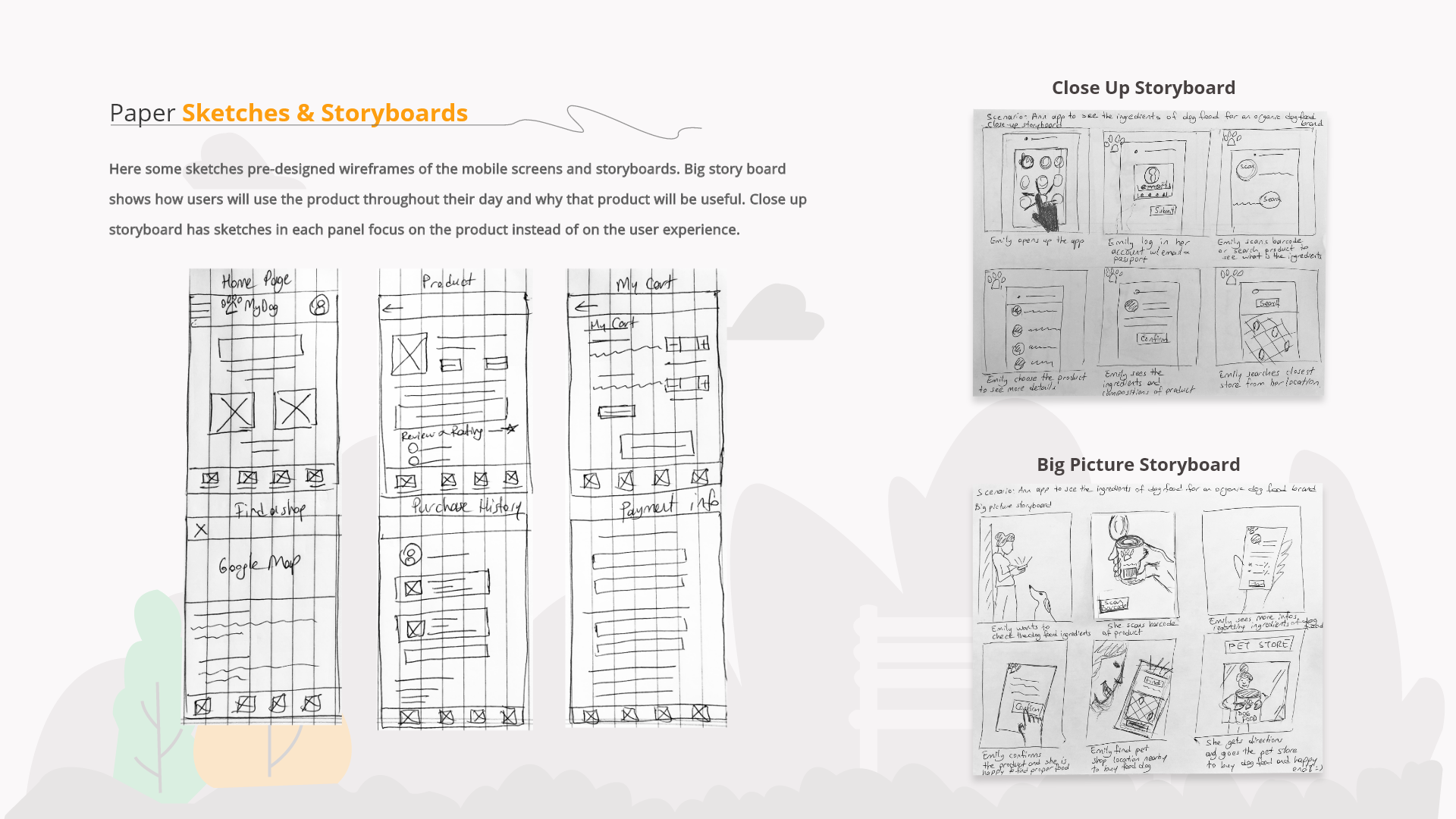
Paper Sketches & Storyboards
Pre-designed wireframes of mobile screens and storyboards. Big storyboard shows how users will use the product throughout their day. Close-up storyboard focuses on the product experience.
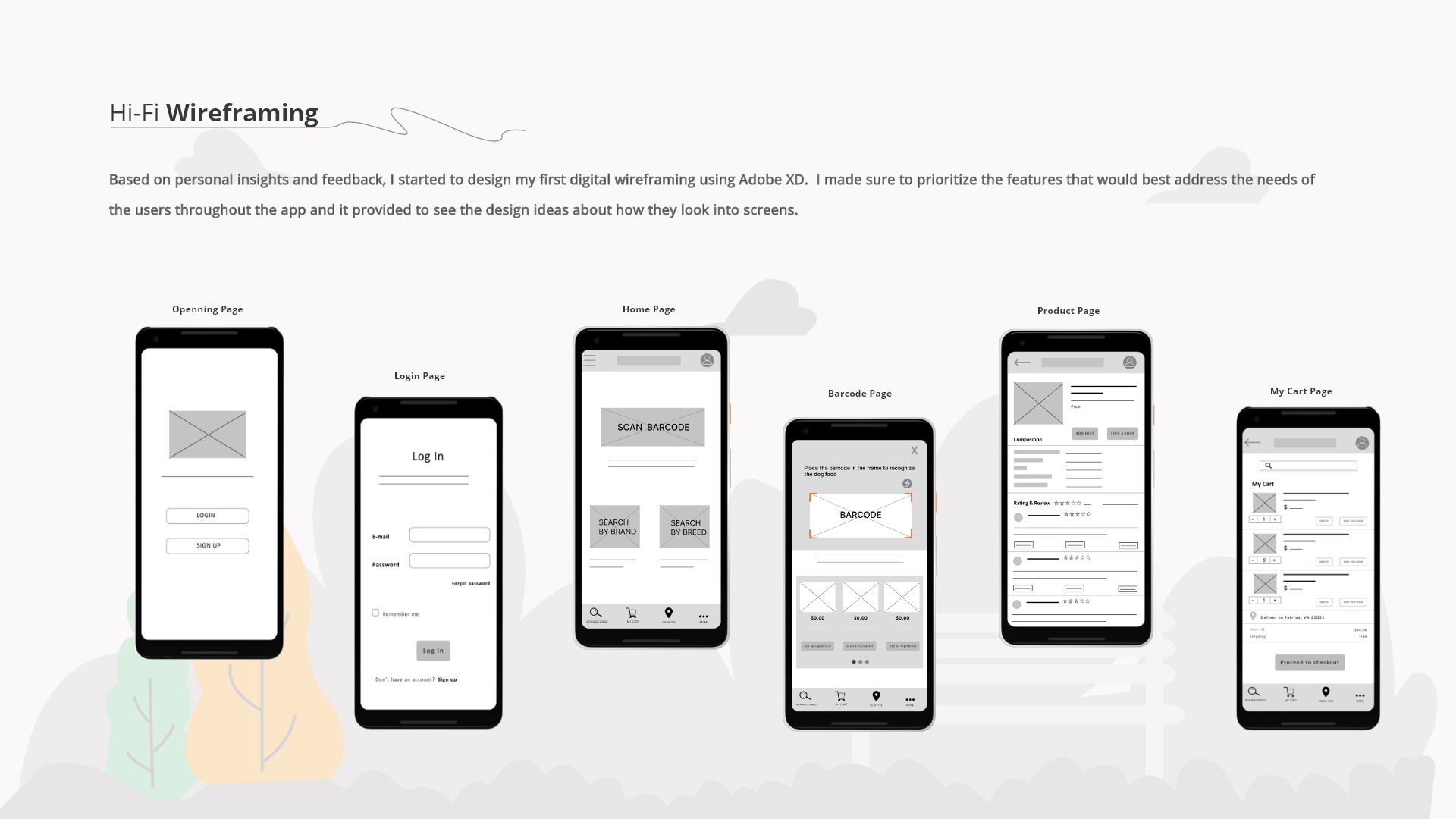
Hi-Fi Wireframing
Based on personal insights and feedback, I designed my first digital wireframes using Adobe XD. I prioritized features that would best address user needs throughout the app.
Changes After Feedback
- Added clearer visual hierarchy to the barcode scanning page with a prominent frame indicator.
- Increased button sizes throughout the app based on usability testing feedback.
- Simplified the cart page layout to reduce cognitive load during checkout.
Design System
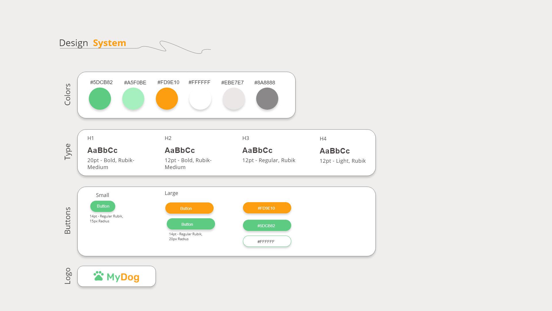
System Components
- Color roles: Green (#5DCB82) for primary actions and success states. Orange (#FD9E10) for secondary actions and highlights. Neutral grays for text and backgrounds.
- Type scale: Rubik font family with four weight variations (Bold-Medium for H1, Bold-Medium for H2, Regular for H3, Light for H4) ensuring clear hierarchy.
- Button hierarchy: Small (14pt, 15px radius) and Large (14pt, 20px radius) buttons with consistent styling across green, orange, and white variants.
Hi-Fi Prototype
After including user feedback from mid-fi wireframe tests, I created a high-fidelity version. This experience was enriching and provided necessary improvements.
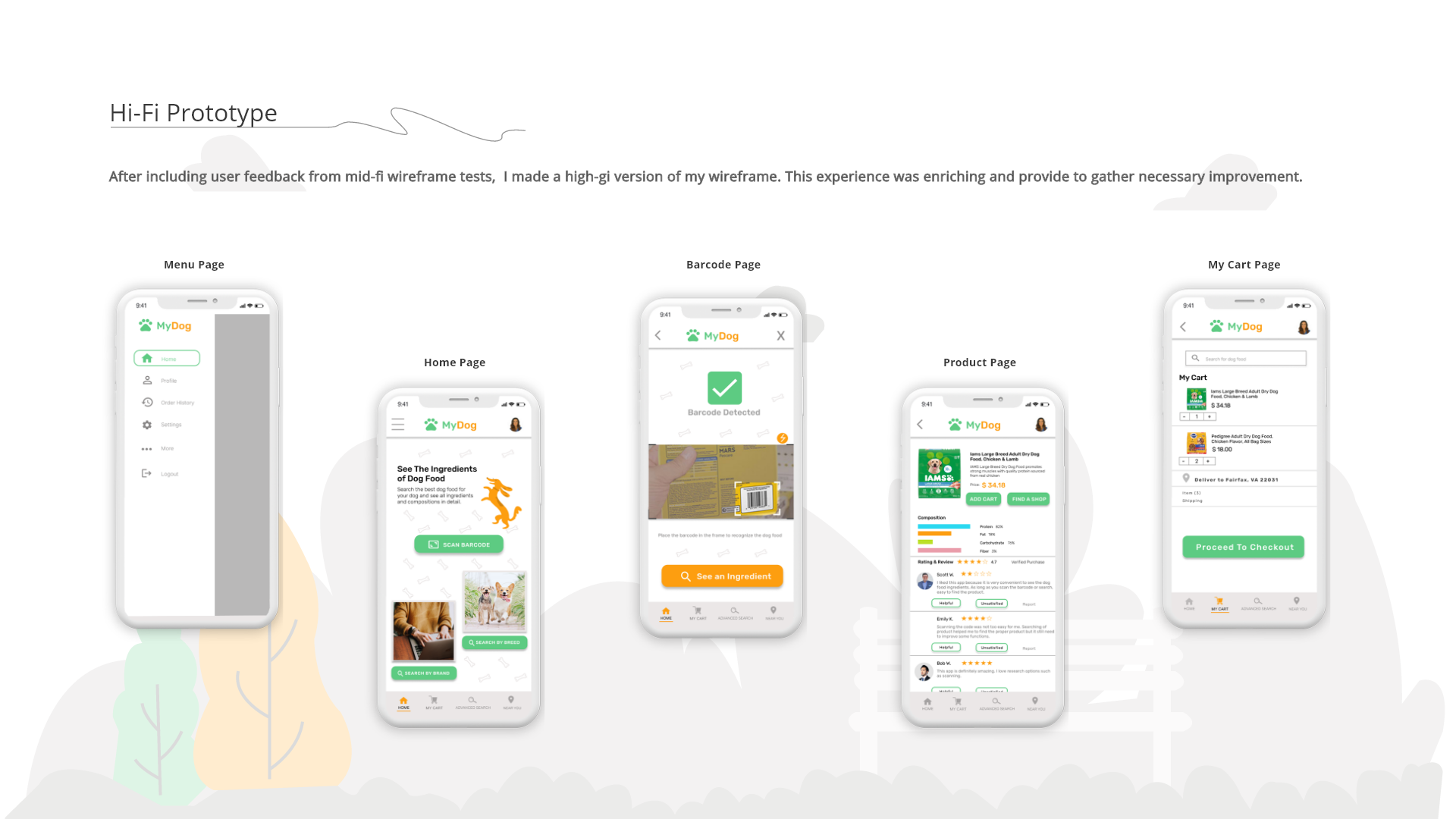
Watch the end-to-end flow from scan to checkout:
Checkout & Post-Purchase
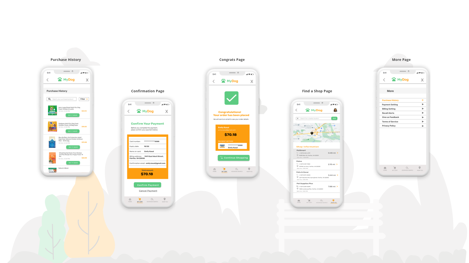
These screens support repeat usage and purchase confidence. They reduce friction during checkout, confirm completion clearly, and help users find nearby stores.
Purchase History
Enables quick reorders and comparison over time.
Confirmation
Prevents payment errors and builds trust before submission.
Success
Confirms completion and routes users back to shopping.
Find a Shop
Moves users from research to purchase nearby.
More
Centralizes settings and self-service actions.