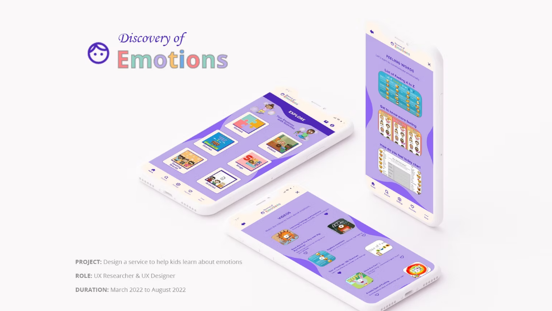
Discovery of Emotions
A learning service that helps kids identify, name, and express emotions through short activities designed for shared parent and child use.
Discovery of Emotions is a mobile learning experience built to make emotional vocabulary easier for kids to understand and use. I focused on simple navigation, engaging activity formats, and a calm visual system that keeps attention on the learning moment.
Project Snapshot
Role
UX Researcher & Designer
Timeline
March – August 2022
Platform
Mobile + Tablet
Tools
Figma, Illustrator, Photoshop
Problem
Kids often struggle to name emotions in the moment. Parents need quick, structured activities that keep attention and make it easier to talk about feelings.
Goal
Help kids learn emotional vocabulary and practice expressing feelings through guided activities that fit into short daily routines.
Outcomes
- Built a structured content model organized into games, videos, stories, songs, feeling words, and articles.
- Designed repeatable interaction patterns that reduce cognitive load across sections.
- Created a friendly visual system that supports hierarchy and readability.
Vision & Challenges
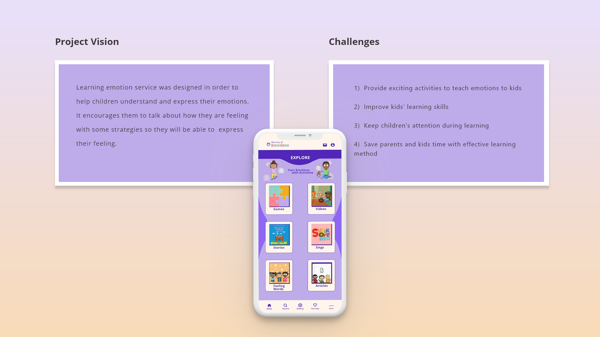
Vision
Support children in understanding and expressing emotions, while helping parents guide the conversation with simple activities.
Constraints I Designed Around
- Short attention spans and varying reading levels.
- Navigation that must stay predictable for kids.
- Content that must feel playful without becoming noisy.
- Learning that should feel rewarding without heavy gamification.
Kickoff & Approach
I started with goal-directed design to define the learning experience, identify the right activity formats, and clarify what needed to be true for families to use it consistently.
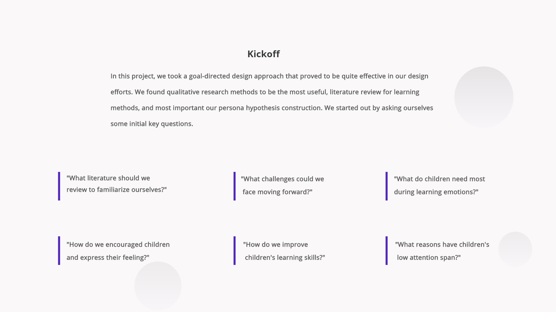
What I Prioritized Based on Kickoff
- Activity-first learning over long explanations.
- A consistent home structure that makes choices feel easy.
- Clear section grouping and labeling to reduce decision fatigue.
Audience & Personas
Primary User
Parent or caregiver who selects activities and guides learning.
Secondary User
Child who completes activities and builds emotional vocabulary.
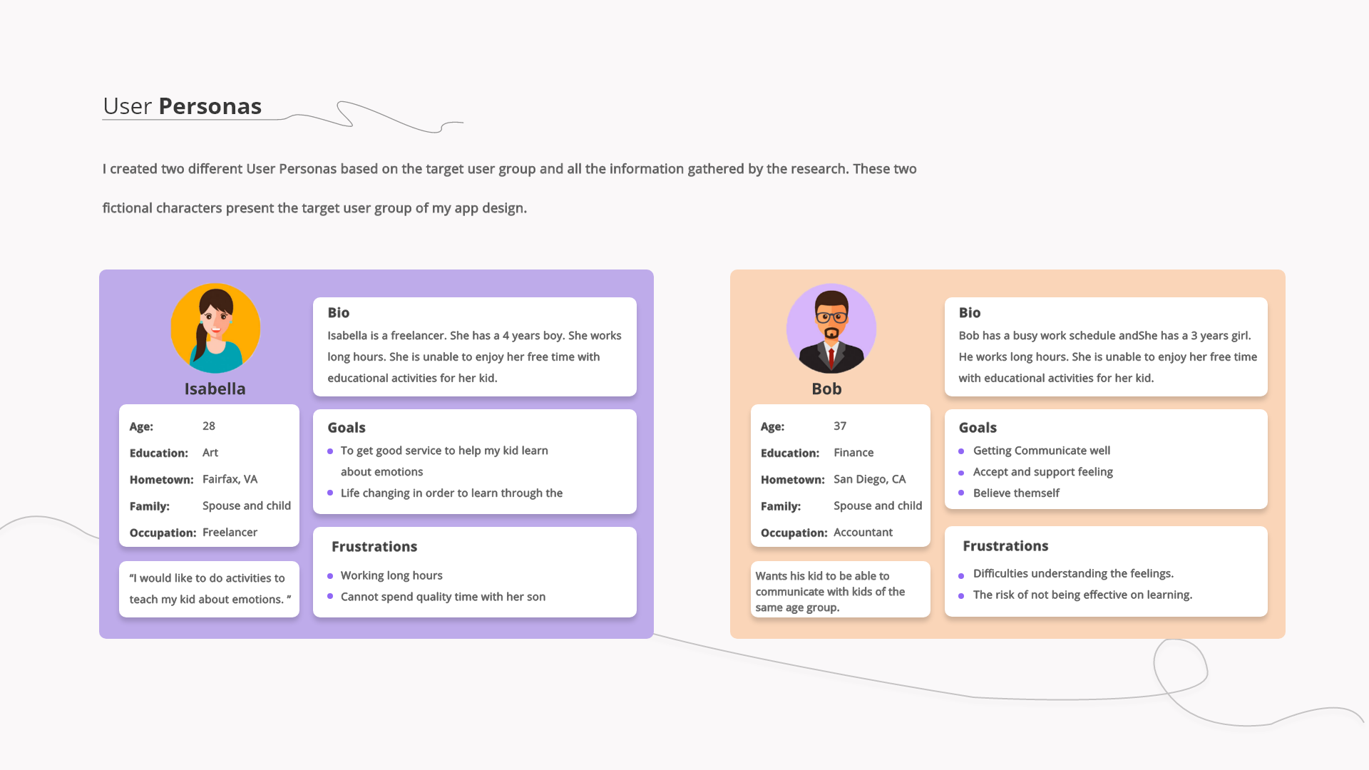
These personas guided content structure, navigation clarity, and the balance between parent control and child independence.
Research Synthesis
Research Focus
Understand what makes emotion learning approachable for kids. Identify activity formats that keep attention. Map friction in navigation, search, and discovery.
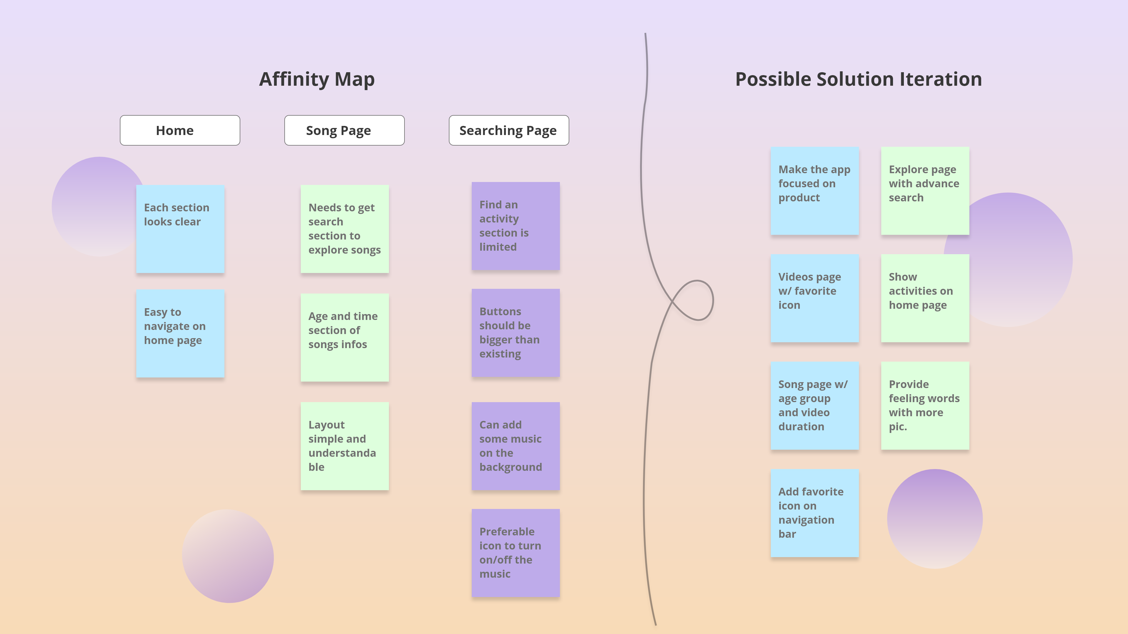
Key Insights & Design Decisions
Insight
Kids respond better to visual choices than dense text.
Decision
Used large activity tiles with icons, short labels, and consistent spacing.
Insight
Users want fast access without searching deeply.
Decision
Made the Explore page the main hub with clear categories and predictable placement.
Insight
Repetition builds learning.
Decision
Supported favorites and kept category patterns consistent so returning users build familiarity.
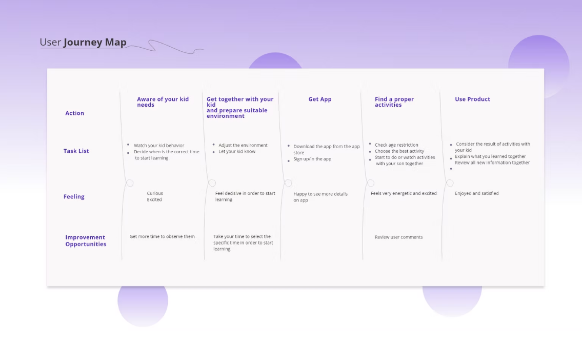
Journey Map
Journey mapping aligned content, timing, and parent participation across the learning loop from awareness to repeated use.
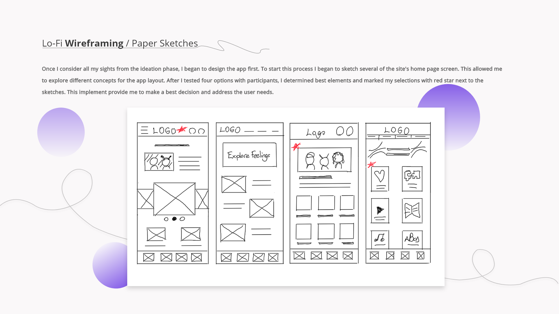
Lo-Fi Exploration
I explored multiple home layouts to minimize taps to the first activity and validate structure before moving into visual styling.
What Changed from Lo-Fi to Hi-Fi
- Simplified the home layout to emphasize the core activity categories.
- Reduced visual noise so content cards stay the focal point.
- Strengthened bottom navigation for predictable movement.
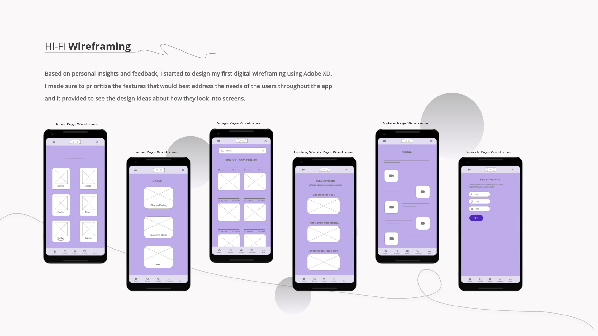
Hi-Fi Wireframes
These wireframes established consistent layout, hierarchy, and spacing before final UI decisions.
Iteration Highlights
- Standardized tile sizing and spacing across categories.
- Increased touch target size and reduced dense clusters.
- Simplified search into a small set of inputs.
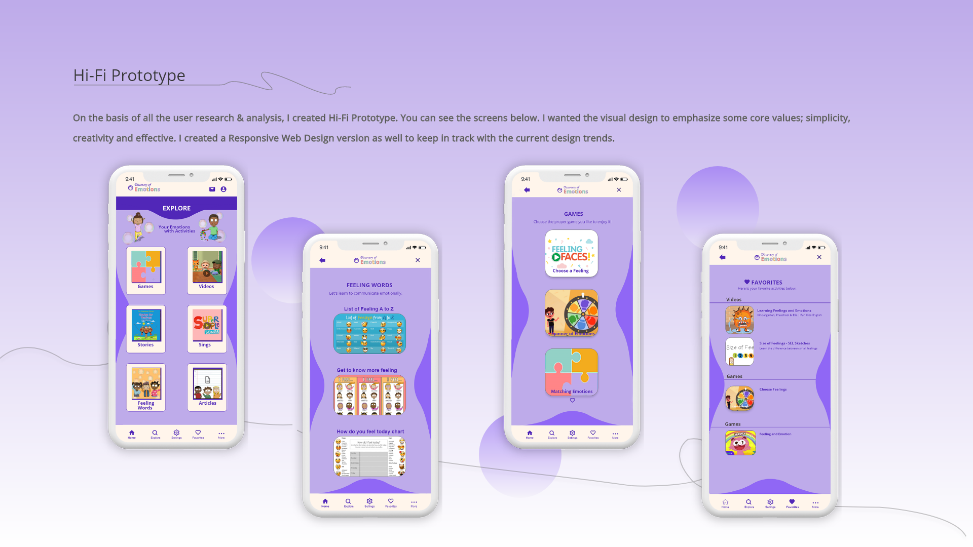
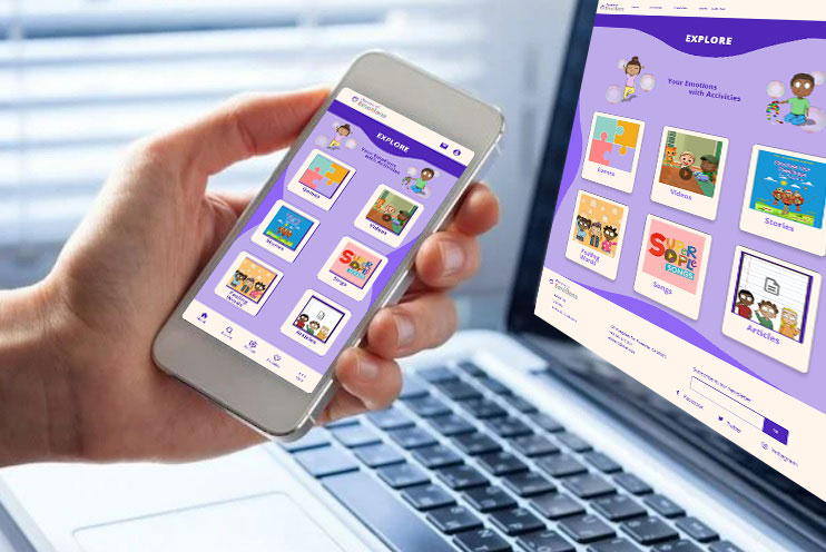
Final UI
Final Experience Highlights
- Explore hub gives kids a clear starting point.
- Feeling words supports vocabulary building through visual reinforcement.
- Games and stories keep learning active, not passive.
- Favorites supports repeat learning and quick return sessions.
Real World Context
Designed for real-world use, with a layout that stays clear across devices and contexts.
Prototype Video
Watch the end-to-end flow from first launch to activity start.
Responsive & Tablet Adaptation
I adapted key flows for tablet use to support shared parent and child interactions and longer learning sessions.
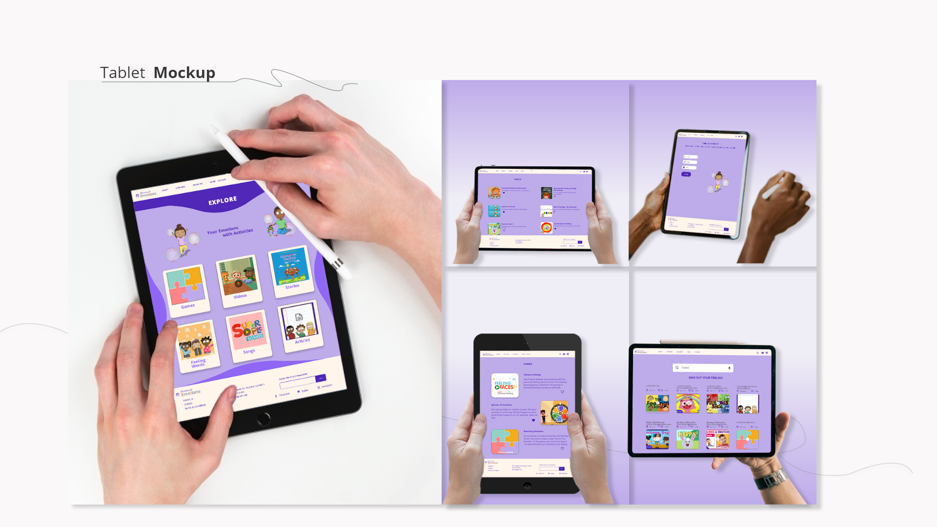
What I Optimized for Tablet
- Reworked layout density for larger screens while keeping the same navigation model.
- Increased touch targets and spacing to reduce mis-taps.
- Kept activity tiles and content cards consistent across phone and tablet to preserve familiarity.
Reflection & Next Steps
What I Would Validate Next
- Run usability sessions with parent-child pairs to confirm navigation and comprehension.
- Measure which activity formats drive repeat use over time.
What I Would Improve Next
- Add a lightweight progress indicator that reinforces learning without pressure.
- Create a parent setup path to tailor age group and content preferences early.
What I Would Measure
- Time to first activity start.
- Return rate to favorites.
- Completion rate per activity format.
- Parent-reported confidence discussing emotions after use.